


Survival is getting more expensive
A quick look at some economic data

Sometimes, I can’t help but think that life seems to have gotten more expensive over the past few decades. Here’s a casual look at some data to see if this hypothesis holds.
Median income
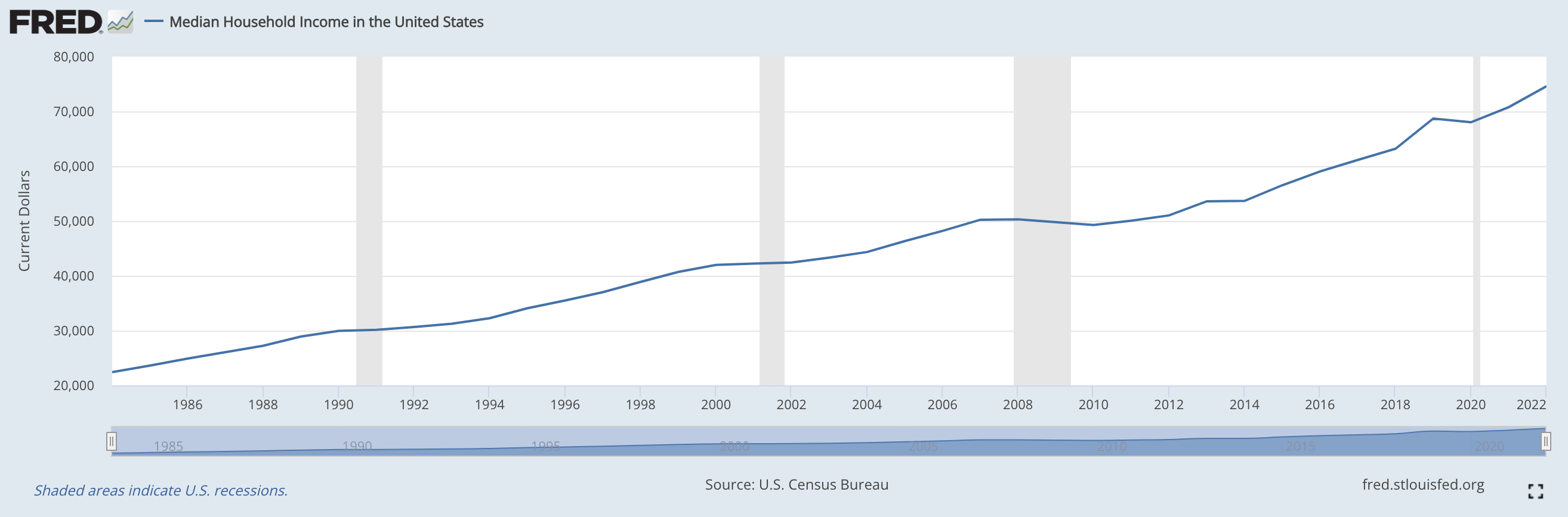
The Federal Reserve Bank of St. Louis publishes a ton of useful historical price data. Their records show that median income in the U.S. has grown from ~$22.5k in 1985 to ~$75k today.
(Source)
Median house prices
FRED once more comes in clutch, informing us that the median house back in 1985 cost around $80k, which has risen to around $430k today.
(Source)
Personal healthcare expenditure:
FRED also tracks personal healthcare expenditure, which I find more useful than spending per capita given the confusing spending patterns of healthcare in the U.S.
In this case, spending has gone from around $300/y to $3000/y over the same timespan from 1985 until today.
(Source)
College
The Education Data Initiative tracks historical prices and inform us that public college tuition + other fees have grown from around $1.3/y back in 1985 to $9.5k/y today.
(Source)
Childcare
FRED only reports an index, which is disappointing but perhaps makes sense given the broad range of childcare offerings across the country. With 1982-1984 as the baseline, 1985 saw prices rise by 15% to 115, while the index today is at 840.
(Source)
Food
The index for food in urban centers has gone from $105 in 1985 to $320 today.
(Source)
Transportation
Car prices have remained the same or even decreased a bit going back since the mid 1900s!
(Source)
Breakdown of consumer expenditure
The Bureau of Labor Statistics reports breakdowns of average household expenditure patterns, and finds the following breakdown for the median household in 2022:
Housing: 33.3%
Transportation: 16.8%
Food: 12.8%
Personal insurance and pensions: 12.0%
Healthcare: 8.0%
Entertainment: 4.7%
Other: 4.1%
Cash contributions: 3.8%
Apparel and services: 2.7%
Education: 1.8%
(Source)
Given this breakdown, we can actually calculate an alternative inflation metric – let’s take the average of the inflation rates for each of the categories above for which we have data, weighted by how much the average person spends on each category today.
Feel free to do the math yourself, but I arrive at the following numbers:
Housing: +437.5% (4.5%/y)
Transportation: let’s leave this at 0
Food: +204.8% (3.0%/y)
Personal insurance and pensions: let’s keep this at 0 too
Healthcare: +900% (6.2%/y)
Entertainment: let’s leave this and everything else at 0
Note that wages have grown +233.3% in this time period (3.2%/y).
Only counting the rising cost of housing, food, and healthcare, (leaving everything else at 0) we get an inflation rate of 0.333 x 4.5 + 0.128 x 3.0 + 0.08 x 6.2 = 2.38%.
However, noting that this accounts for 54% of the total expenditure breakdown, we could also adjust this upward by dividing by 0.54 and get a different number: 4.4%, the weighted inflation of “survival” (housing + food + healthcare).
This is only 1.2% higher per annum relative to the median wage growth over that same period, but small numbers compound – 1.2% growth over 10 years results in a 12.7% total price change, and a 57% increase over the 38 years from 1985 until today.
Of course it doesn’t account for improvements in quality of goods, distributions (e.g. inequality, city vs rural real estate, etc.), deflation in many other categories, and other improvements in life quality over the same time period.
That said, the feeling that “survival” is getting more expensive seems reasonable from this initial glance.